Tuesday, August 10, 2010

Monday, August 9, 2010
design matters: Pictograms are visual messaging
design matters: Pictograms are visual messaging: "we use symbols for communication verbal and non verbalVisual symbols help to define a message"

The Sign Design Society Event: Defining a City
Tuesday, April 6th, 2010 Guest article by Hayley Branston - Wayfinding_UK

‘Defining a City - How an informed choice of materials can influence a design and define the values of a City’, an event by the Sign Design Society.
 As part of Transport for London (TfL), London Buses is responsible for securing the provision of bus services throughout Greater London in a safe, efficient manner, while encouraging the use of buses and public transport. Surface Transport Infrastructure Development are responsible for the design and development, specification, installation and maintenance of the supporting infrastructure within Greater London. As the main point of contact with passengers, bus stops in London currently total over 19,000.
 Ivan began his presentation by putting the scale of the London Bus project into perspective. Every weekday over 6,500 scheduled buses carry around 6.25 million passengers on over 700 different routes, amounting to over 1.7 billion journeys a year. He was also keen to point out that the first use of the iconic roundel was the 19th-century symbol of the London General Omnibus Company; its usage on the Underground came later.

Background Information
As part of Transport for London (TfL), London Buses is responsible for securing the provision of bus services throughout Greater London in a safe, efficient manner, while encouraging the use of buses and public transport. Surface Transport Infrastructure Development are responsible for the design and development, specification, installation and maintenance of the supporting infrastructure within Greater London. As the main point of contact with passengers, bus stops in London currently total over 19,000.Introduction
Mike Wolff, Chairman of the SDS, introduced Ivan and highlighted that the society often discuss the graphic design and strategy of wayfinding systems, but talk less about the design of products. That in mind he was very keen to get the event underway.
London Buses - The Facts
Ivan began his presentation by putting the scale of the London Bus project into perspective. Every weekday over 6,500 scheduled buses carry around 6.25 million passengers on over 700 different routes, amounting to over 1.7 billion journeys a year. He was also keen to point out that the first use of the iconic roundel was the 19th-century symbol of the London General Omnibus Company; its usage on the Underground came later.History of London Buses
Illustrations of old shelters showed how little the identity had changed over the years and demonstrated how forward thinking London were in a period hung up on embellishment. Ivan emphasised the importance and influence of Frank Pick, head of the London Underground in the 1910s and 1920s and of the newly merged London Transport in the 1930s. Frank was instrumental in establishing the world’s most progressive public transport system and an exemplar of design management. Ivan went on to explain how Frank’s vision influenced the design of London bus products, including those we see on the streets today.
Illustrations of old shelters showed how little the identity had changed over the years and demonstrated how forward thinking London were in a period hung up on embellishment. Ivan emphasised the importance and influence of Frank Pick, head of the London Underground in the 1910s and 1920s and of the newly merged London Transport in the 1930s. Frank was instrumental in establishing the world’s most progressive public transport system and an exemplar of design management. Ivan went on to explain how Frank’s vision influenced the design of London bus products, including those we see on the streets today.
Creating Successful Products
TfL are a well known brand and the legacy of their products has a huge impact on defining the city. Their products and use of materials also help define the values of the system. Ivan identified his three intrinsic factors for creating successful products:
TfL are a well known brand and the legacy of their products has a huge impact on defining the city. Their products and use of materials also help define the values of the system. Ivan identified his three intrinsic factors for creating successful products:
- Aesthetics
- Appropriateness
- Economics
Even in the early 19th century, London Transport realised the importance of these values.
“The test of the goodness of a thing is its fitness for use. If it fails on this first test, no amount of ornamentation or finish will make it better; it will only become more expensive and more foolish.” - Frank Pick
It was clear that Ivan and his team design products with a clear focus on ‘Appropriateness’. They adopt a cradle to grave approach to design and Ivan listed key considerations in their design process:
- Who will use the product?
- What will the product be used for?
- How long does the product need to last?
- What possible impact does the product need to withstand? (vehicles, pedestrians, weather)
- How often will the product need to be updated?
- How will the product be maintained?
- In particular when looking at materials:
- Do the individual materials proposed work together?
- Are the materials used sustainable?
- Do the materials work within the surrounding environment?
- What is the life span of individual materials?
- How will materials be disposed of at the end of the products life?
Current Product
Using a full scale replica of a bus stand located at the front of the room, Ivan described in detail the design of the current product used at bus stops.
Using a full scale replica of a bus stand located at the front of the room, Ivan described in detail the design of the current product used at bus stops.

Click to enlarge the busstop details.
Many of the components are easily switchable. Ivan demonstrated how using a tiling system, bus stop numbers could be changed and moved almost like pieces of a jigsaw puzzle.
Examples of timetables, route maps and network maps helped show how London Buses have simplified information to make it easier for bus stop users to answer three key questions:
- Where am I now?
- How do I get from A to B
- How will I know when I get there?
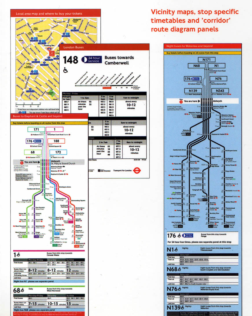
Click to enlarge the map busstop details.
A good example of this simplification of information is the timetable, where individual times have been omitted and instead only first and last buses are listed along with the general frequency of buses throughout the day.
Where other systems fail
One reason other systems have failed is the lack of continuity. London bus stops extend beyond central areas and cover all routes in Greater London. Ivan indicated that passengers do not just want information about where they are travelling from, but when they get there, they need the same consistently presented information. People need information near their homes and local areas, not just in the centre of the city.
One reason other systems have failed is the lack of continuity. London bus stops extend beyond central areas and cover all routes in Greater London. Ivan indicated that passengers do not just want information about where they are travelling from, but when they get there, they need the same consistently presented information. People need information near their homes and local areas, not just in the centre of the city.
Ivan also pointed out that many systems fail because they do not own their products. London Buses design and build their products and own the intellectual property rights. This allows TfL the freedom to change manufacturers without having to reinvent their products. Continuity of the brand is maintained and London Buses can continually work on evolving their products.
Questions and Answers
The session concluded with a questions and answers forum. Unsurprisingly many of the questions focussed on manufacturing methods and material choices, but several of the questions were centred around brand identity and the roundel. A debate began on the use of the roundel and whether overuse was diluting its visual impact, a subject I am sure we all could have continued discussing at length, but time was pushing on and Mike sadly had to draw the session to a close.
The session concluded with a questions and answers forum. Unsurprisingly many of the questions focussed on manufacturing methods and material choices, but several of the questions were centred around brand identity and the roundel. A debate began on the use of the roundel and whether overuse was diluting its visual impact, a subject I am sure we all could have continued discussing at length, but time was pushing on and Mike sadly had to draw the session to a close.
Conclusion
I have been to several events organised by the SDS, but this was one of my favourites. The presentation was filled with facts, history, illustrations and physical examples. Ivan is obviously very knowledgeable on the subject and passionate about his job and this came through in his presentation.
I would like to thank Ivan, Mike, Michelle and the SDS for another great event.
- For more information on the SDS visit: The Sign Design Society

Sunday, August 8, 2010


Signage and Wayfinding
Airports
Airport signs & wayfinding systems are guides to show visitors the way. From finding the toilets, gates, tranfsers or even the coffee corner, signs are needed to show the way. Airport signage design is not a easy task and creating a wayfinding system in a airport which will have to guide thousands of visitors takes a in-dept case study of the visual environment, travellers stream, detailed prints of the building and much more. In this photo showcase I’ve collected images of Airport Signage from cities all over the world, using the photo website flickr.
Düsseldorf Airport Signs
When designing signage for a Airport or a other public building you have to take a good notice of the visual surroundings the signage will be placed in. The backgound colors of walls and windows, the amount daylight let in the building, the lighting and more environmental elements are important when designing signage for a aiport. In a visual crowed environment it is important that signage design stands out to its background, for a maximum effect. Use a color system with not to many variations and be consistant with the color usage. Think about using illumnated signs to enhanche the readability of the signage and always use mockups of the signs to test if the signage is working in the visual surroundings.
Color, typography design and use of pictograms
Design high contrast signs to ensure good readability and legibilty of the signage. Colors that work well are a dark background with a light colored text and pictograms. For example a black background with white illuminated lettering will ensure a high contrast which has a good readability from a distance. Other commen color combinations are a yellow background with black lettering. For typography use a sans type like FF Info by Erik Spiekermann or Frutiger by Adrian Frutiger. Use a font that have a high x-height which will increase the legibility of the signs. Use only one font in all visual communication levels of the airport signage. For international airports it is vital to use symbols to indicate the facilities in and around the airport, always strengthen the symbol with written text in the native language and perforably in English language. This will ensure that most of the visitors can read the signs.
Dusseldorf Airport Signs FF InfoPhoto credit sabrinak
Typeface FF Info
FF Info
Designed by Erik Spiekermann and Ole Schäfer, FF Info Collection offers a large variety in type weights and pictogram sets with a good legiblity suitable for airport signs.
Arrow design
Arrows are one of the most important design features of a wayfinding system for airports, with a pointing arrow you will be able to guide visitors to their destination. Choosing a arrow within a design can make or break the design, don’t over due the arrow but gently incorporate the arrow into the sign in balance with type. Recently I’ve released a arrow collection to use in a design. Download the 56 free arrows as a Illustrator vector file here.
Sign design using a grid
Always use a grid to design Signage & wayfinding systems in order to maintain balance and flexibility in the design. In a future article I will go in dept by explaining how to design signage using a grid.
For more information and photographs
go to http://www.designworkplan.com/design/airport-signage-photo-inspiration.htm
Subscribe to:
Posts (Atom)